Website powered by

Arcade Environment Remake, Update 3

General / 09 July 2018

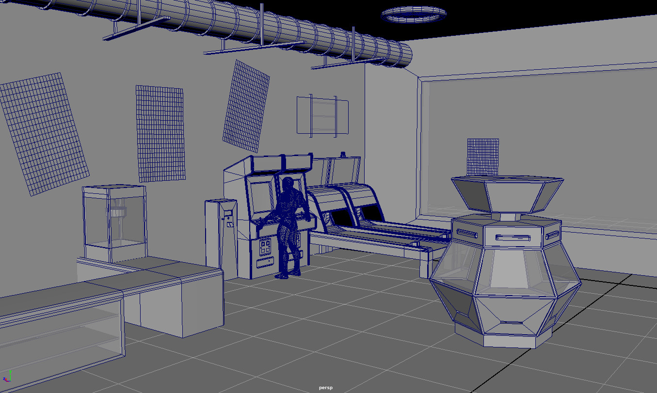
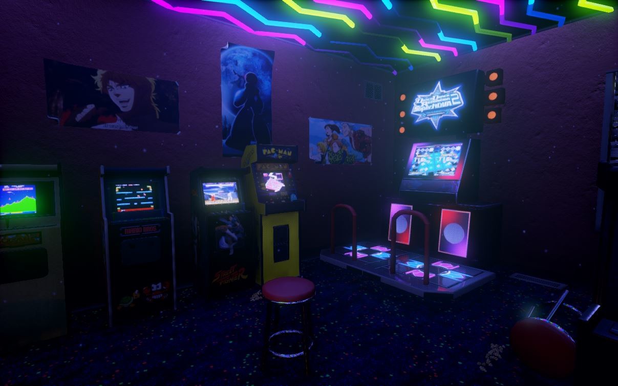
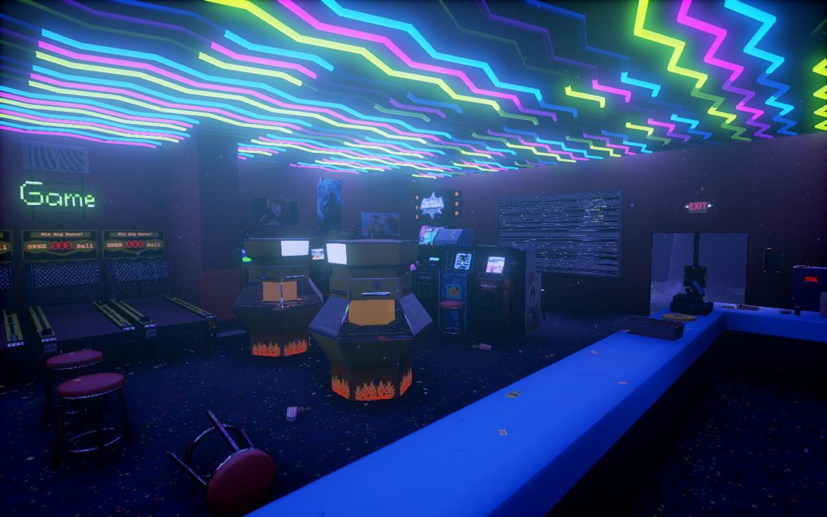
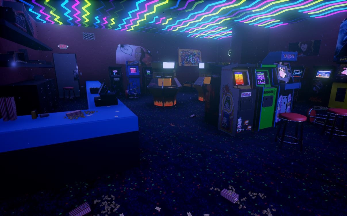
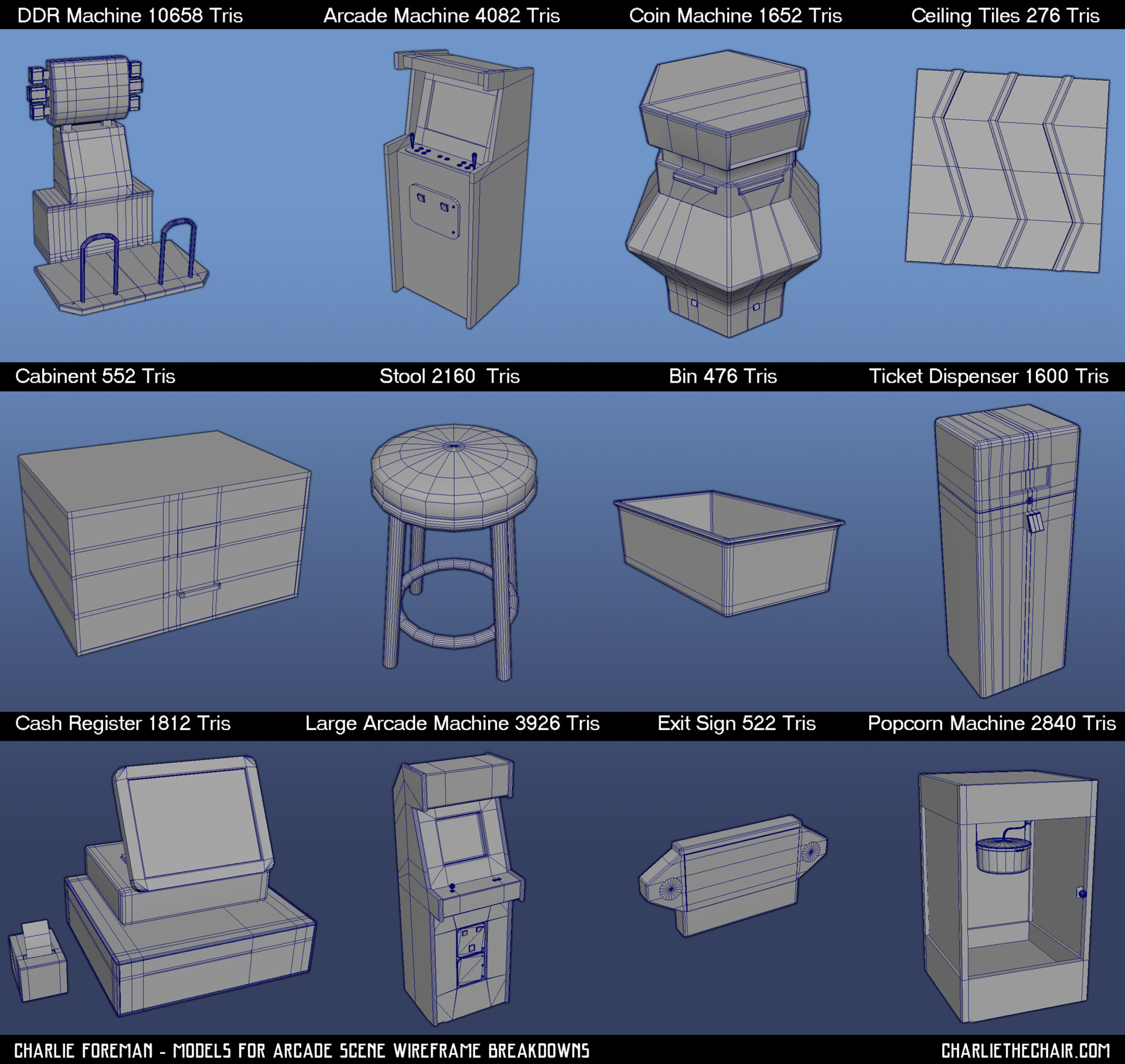
I've been hard at work working on some textures for the scene. Here's the basic setup I have with some of the main assets blocked in. I've decided for now to focus on the interior. I lowered the ceiling a bit more and also moved around some of the assets. Here's the first glance of the room and composition with zero lights.

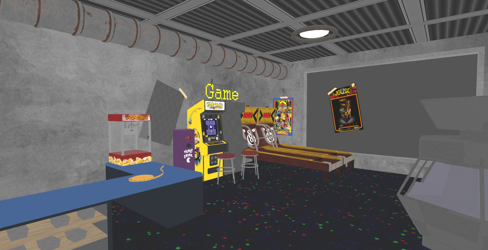
I haven't finished texturing every asset, but I did want to try and focus more attention in the center of the room, using the bright colors of the machines and more greys. The next step after establishing the composition, I can see certain parts that need more detail. The model of the counter likely needs to be overhauled, given how the glass and containers for the game corner prizes don't have the required space that the eye would be drawn to. The top shelf is too close to the roof of the windows. As well as that, the light designs seem a bit too plain for the space.

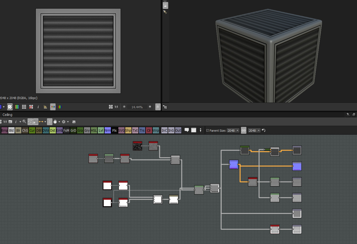
To go along with all those model changes, more additional textures like mentioned above will be required. Speaking of Textures, I decided to go into Substance Designer a bit to get myself the texture for the ceiling as pictured above. Below is the graph I made quickly. It took about 10 minutes to create this material. I wanted it to be simple and tileable, and am content with the result.

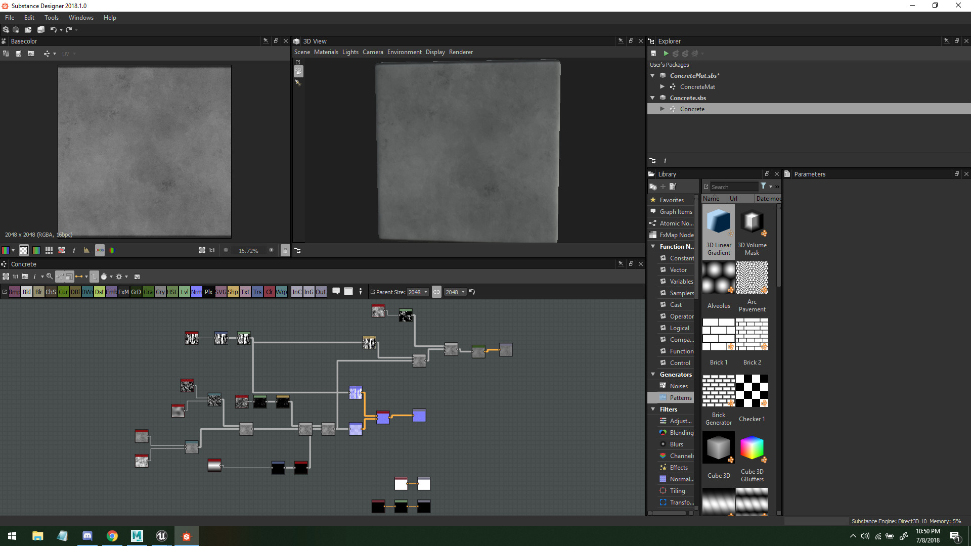
I also made a simple concrete for the wall


Afterwards I worked on some more textures as pictured. I decided to make one Arcade Machine to start, and can move around the textures to copy for the other machines. If I want to change the joystick setups, I can simple delete the static mesh parts without moving my UV's, which saves me time in the long run.


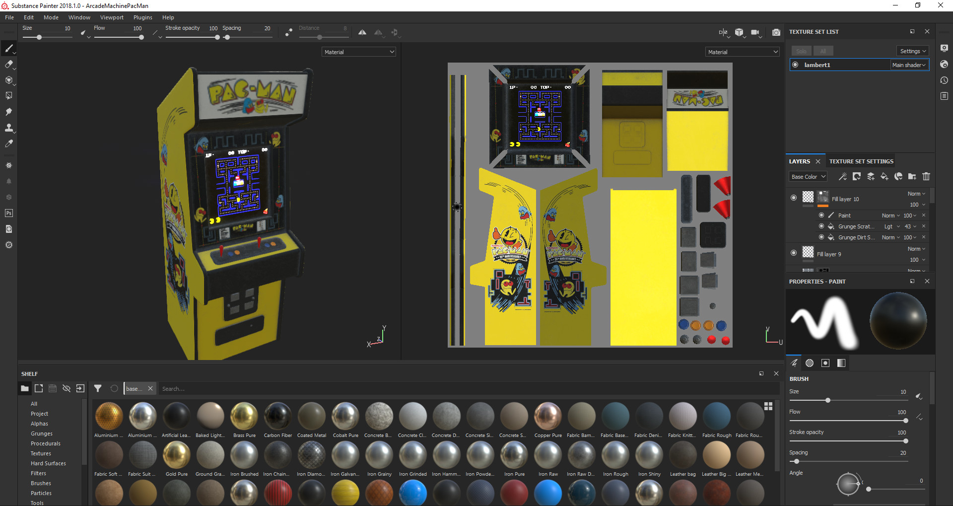
With the machines, I think its important to make sure to get the sort of reflectiveness in the screens that cause them to glow and cause slight illumination. The screens themselves are emissives, but one thing I noticed as I put these assets together for the next post is that I need to push the screens further in so I can create the reflective surface, since normally the screens are indented further inside.


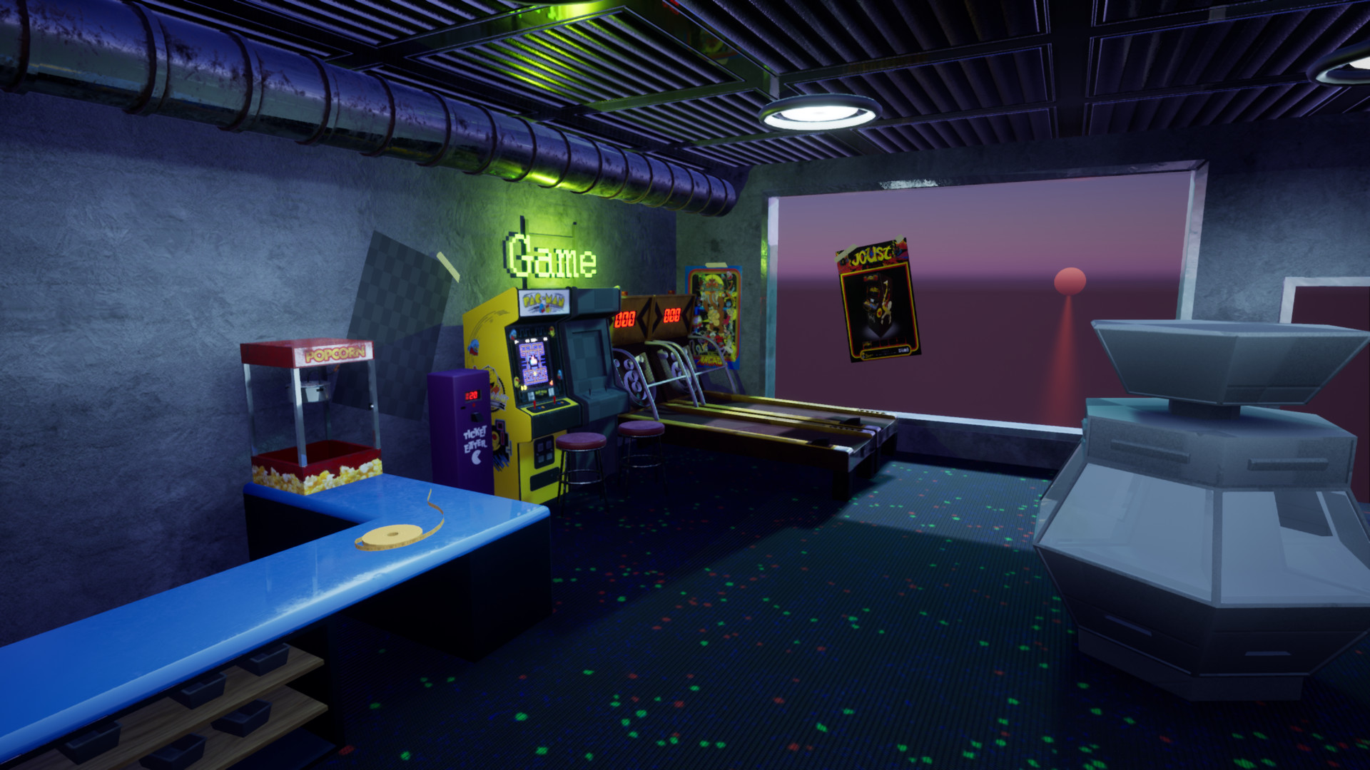
I placed a few lights in to start to feel out the scene but it needs a ton of work. After all the assets are polished up and textured, I can get to work on seriously lighting the scene. By having a few lights in to begin with, the material metals begin to shine through and allow me more understanding of how the light bounces. From here I can see the roof and the pipe might be way too shiny, and that the sign needs emit less glow regardless.

Thats all for this first pass. I have a lot of things on the bucket list for the next update, so I'll be focusing on those for the next post!

My bucket list includes for the next update
-Finishing the other Arcade Machine texture
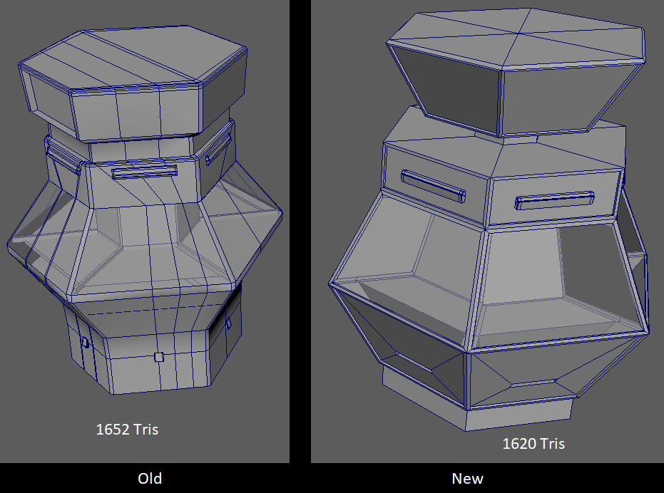
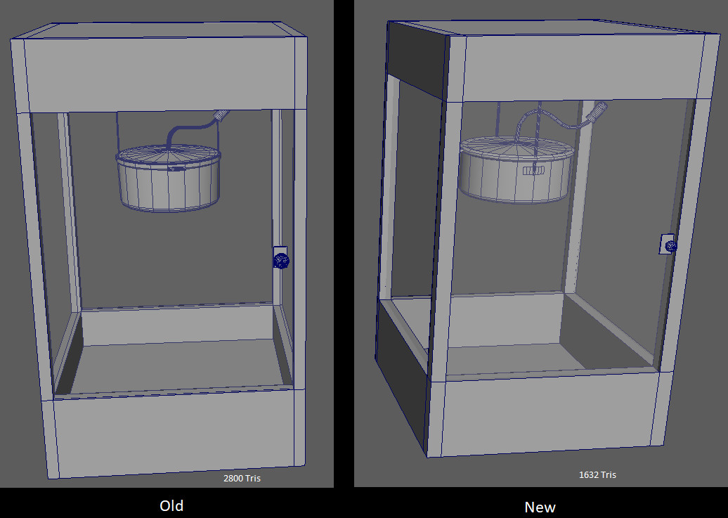
-Fixing the Counter to make it less cluttered where the prizes are, as well as refining the glass
-Readding an Opacity mask on the light atop the SkeeBall Machine
-Adding more ceiling fixtures
-Adding Popcorn to the Popcorn Machine
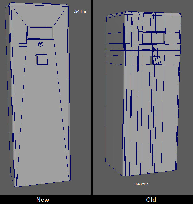
-Texture the Coin Machine

After that, it's all cleanup on textures, and then lighting!

Arcade Environment Remake, Update 2

Work In Progress / 27 June 2018

It's been over a week, and this blog post is late due to me passing out from working at ID Tech almost every night. However whenever I came home I tried to get a little bit done on this piece. With my job taking up most of my time, I feel like I've been glancing over some important details.

I began gathering reference images related to some more neon areas. I prefer the scene to be moody and let a lot of the lights of the emissive neons do their work, Since the scene is an interior, I didn't gather many references for the exterior, but still went through the process of grabbing a few glances from the outside.


After looking over the images, I think the two images on the top are more representative of what I want to see in the environment from the exterior. Since however I enjoy the large windows in the bottom right image, I think I'm going to use to bring some natural light into the scene, where before the very little natural light i had was purely through the blind shudders of the Arcade before. Alongside the lighting from the machines, I've assembled a small moodboard of interiors to see the different forms of unnatural light and layouts of the machine.


Some of the things that stuck out to me are the carpets, ceiling tiles, and the ventilation in the images above. I like the dark blue of the carpets as it matches my old one and gives me an idea of how the floor lighting can be dimmed along, given the patch of light in the upper right image showcasing how the carpet doesn't seem to catch all that much light. The machines and cabinets are very similar to each other, so for now I think i'll be focusing on the simple machines and making a more small corner to the arcade. This time instead of going for quantity, I should be focusing on quality. I'll be limiting myself to four machines, my skeeball machine, which needs only a retexture, My Arcade cabinets, and the coin machine.

The Coin machine model I believe was one of the weakest parts of the previous scene, so I made a more divisive moodboard for it.


The Coin Machine is one of the machines that I'm most interested in remodeling due to it's complex shape and the fact that I'm a much better modeler than I was back when I first started this project. So with all my reference images in hand, it's time to get back to work. I decided to first focus on multiple machines, redoing their models since they had high polycounts before and since I've gotten a lot better at modeling, wanted to fix a lot of the wacky topology that occupied them. Below I have the side by sides of the more complex models, or ones that saw a drastic decrease in Polys compared to the old ones. The Coin Machine pictured below was the most different compared to before, as I was much less careless with Edge Loops and have a better understanding of snapping and vertices.
 
The process of making the Coin Machine was using the 6 sided Cylinder, and then snapping objects by 60 degrees when rotating in Maya, along with using Component for extrusions to make sure all the sides were evenly spaced. I would use snapping UV stacking to make sure my shells were all even, so I could keep up with the symmetry of the product and not have different edge flows on multiple sides. I also chose to not bevel as much, since the natural shape of the object carried through, and spent the poly budget on making the metal railing cases.

Below are some other models that had too many polygons prior.
  

Reducing the polycount of the Arcade Machine was incredibly important since in my previous scene they were repeated 18 times. It was a lot of unneeded polygons, given that I shaved over 2k off each one, saving almost 40k polys.

The ticket Machine also now Isnt all one object, making it much less ugly.

While not entirely visible, the changes to the Popcorn Machine are on the pot, getting rid of unneeded bevels to reduce the polycount by 1000.

After that, I made several other assets that I felt were required for the scene, redoing small ones. Below is the initial pass at the modular kit, with more models to be added as I deem them necessary.


After a while I created this kit of assets. More are likely to be added after the initial scene setup, but I wanted to figure out the arcade machines before going to the ceiling, which is where a lot of time will be spent lighting. I really like the exposed ventilation in one of my reference images, and think it would be fun to play around with some of the funky lights that could spruce up the scene with neon colors. I think lights that are most subject to change are my round lights, which I've swapped my ceiling for for simplicity sake. Yay for iteration!

I then blocked the scene out in Maya to get a grasp of what I want it to look like.


I took the Unreal Engine man out because I could use him for scale, and plopped him in the scene. An observation I made is the ceiling might be way too high for what I'm going for, and the posters dont seem to scale. I decided to adjust a bit before deciding to import some assets into Unreal and try to do a base lighting test before going further, to see if that affects the spaciousness of the room.


I focused mainly on the directional and skylight of the room, with a point light where the neon sign was. Without materials, it's hard for me to get an accurate reading, but figured it was a good start since it let me check for lightmapping errors, and get the window shadow to cast as I wanted it too. In addition, I moved the ceiling down slightly and scaled a few posters differently so they didnt seem out of place. The overall composition might need some work, so that's my next focus is assembling everything properly.

I'm moving to some texturing next week, so I'll have some more updates by then! I think this blog is helping me spot some mistakes and shortcomings I made, and it's good to let me see the progress tracking. Any feedback is welcome since I'm working on this between my days at ID Tech!

Charlie
  

Arcade Environment Remake, Update 1

Work In Progress / 15 June 2018

Back in late 2016, I began an Environment based on an old Arcade called Nickel City that I visited in Northbrook Illinois. It's a rather old place, with a crusty interior and some of the most archaic machines. I often visited the place when I was young since admission was a dollar and the currency was Nickels, often making many games cost less than a quarter. Five dollars can buy you quite a bit of entertainment for a modern day place like that, as well as the large amount of free to play games.

The old project, pictured below, was an alright start, but it has lots of problems. Lighting is one of them, as a lot of it is not properly gone over, with bloom being a primary problem with the scene.  It also lacks a lot of variation in the roughness and is moreso a scene that demonstrated quantity over quality. The composition could also be improved, so I will be dedicating time to fixing many of the assets whose topology was too high to begin with.

Below is the Original Project Screenshots, this will be the project I am improving and essentially redoing


Originally when working on this project, I had created a mood board of some of the assets. What I've learned since then is while having one for a general direction is good, keeping as many reference images on hand as possible is critical to the success of creating a more realistic piece. Many of these assets can be pushed much further, and that is this scene's biggest fault is that there's too much going on in it, and needs some more direction to help guide it. Below is the original Moodboard used for the version of the project pictured above.


Before I even begin looking for new references, I have many models that I felt could use improvements. Many of them have a lot of unneeded polygons and have edges that disrupt the flow of the models. Focusing on primarily these models first, I would like to first see how many polygons I can cut away, primarily on the game machines. Below is the model sheet with examples of most of the assets from the previous iteration of this project. 

Now that I've given some background on the piece and some things I want to improve upon it, I've already begun work on remodeling some of the assets and doing a blockout of the scene in Unreal Engine. I'll be making textures in Substance Painter and Substance Designer, instead of in Photoshop where I first textured this scene.

I'll post next week with a detailed breakdown of the work I have done on the scene so far and progress i've made.


The Rookies!

General / 07 May 2018

http://www.therookies.co/game-of-the-year/pc-console/kindled-dreams/

Rookies closes in a whole 3 weeks! If you guys haven't seen our game, go check it out! I was a producer and Environment Artist on the project.